Architectural brand concept
A personal exploration of an architectural brand, developed across identity, printed materials, and a website concept.
- Project
- Personal concept · 2022
- Disciplines
- Brand identity / Print design / Website UI
- Design
- Nikoloz Tse.

The idea
One architectural brand, across different experiences
HILLFA explores the relationship between social and urban life. I developed the concept from its core identity through service packages, printed applications, and a digital presence, aiming to keep each part recognizably connected.
One identity. Three service packages
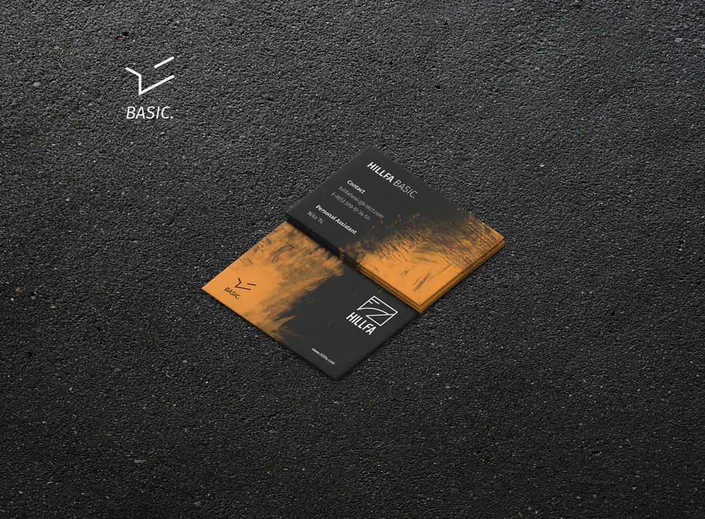
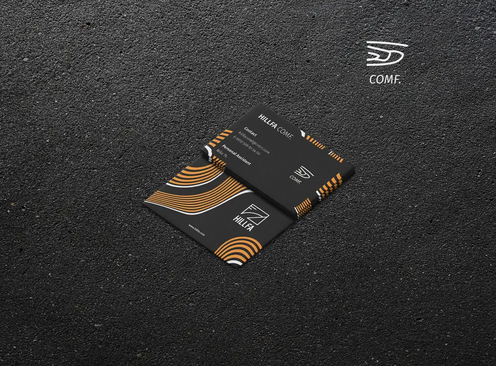
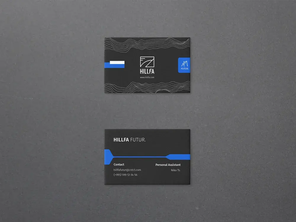
BASIC, COMF, and FUTUR explore different levels of the architectural offer. Each has its own symbol and visual emphasis within the wider HILLFA identity.
BASIC
COMF
FUTUR
A shared visual language
The geometric mark, adapted Georgian and English wordmarks, and a restrained palette establish a common foundation across the brand.


The identity in use
The visual system extends into documentation, project packaging, and a proposed handover item for a new homeowner.


The identity in print
The catalogue brings HILLFA’s service packages into one publication. COMF uses a light layout with orange accents; FUTUR shifts to charcoal and blue. Both share a consistent typographic hierarchy and geometric details.


From identity to interface
The website concept carries the identity into a digital setting, organizing the company overview, service packages, and contact information within a consistent visual system.

The interface concept
The home page reads as one scroll. The header holds the BASIC, COMF and FUTUR products and the light and sound services; below come the hero with the brand showreel, the company, the three packages and selected projects. A chosen option expands while the others shrink, blur or turn black and white, so attention stays on one choice at a time. Each service brings its own accent colour, and testimonials, partners and a contact form close the page.
 Primary information
Partnered shop
Hero text
Brand showreel
Interactive designNon-selected box: reduced size and layer blur
Information about company
"View" buttonFollows the mouse
Main productsBASIC. COMF. FUTUR.
Interactive designChosen option is expanded
Clickable projects
Interactive designChosen option is expanded
Swipe through projects
Service colourIntroduced as the accent
Other servicesAnd more information
Descriptive section
Interactive designNon-selected option is blurred and black and white
Options are clickable
Testimonial space
Provides a sense of trust
List of partnersClickable shop button
Contact areaFill in information
FooterPrimary and secondary options
A public-facing expression
The same visual language extends into an outdoor advertising concept, bringing together the architectural imagery, service packages, and brand message.
